transapps
military, android, appstore

PROJECT
Metronome Software, 2012 - 2015 TransApps (Transformative Applications) is a United States Department of Defense’s “Mobile Apps for the Military” program funded by the Defense Advanced Research Projects Agency (DARPA). The program supported secured military Android apps and the marketplace app store that supported over 3,000 users deployed overseas, including Afghanistan. The TA Marketplace provides a dynamic way for end-users to collaborate with the development community to provide feedback and improve the apps while on the field. Metronome Software worked on the TransApps program to scale and improve the overall design of the TA Marketplace created by a partnered government software company Eucleo. I designed and owned the Marketplace UI revamp of mobile and desktop views through my entire career at Metronome.

WHAT I DID
Mobile Design I started at Metronome as a Software Engineering Intern with a focus in design. TA Marketplace was a web app store that was compatible only for desktop view. For my first intern project, I designed and helped develop a mobile view of the marketplace. I started first by researching similar products such as the Apple app store and Google play store for reference, then testing the ins and out of the desktop TA Marketplace to identify how it can be optimized for mobile. I then proceeded to use Balsamiq to create wireframes and low fidelity mockups.

Balsamiq mockups of high level flow through App Page and Feedback

Iteration on feedback nesting feature
UI Web Development In a heavy engineering culture, I was encouraged to prototype by coding directly on a branch of the codebase. I was self taught in web development using Codecademy in my spare time before the internship and was able to jump right into fixing cosmetic bugs. I ended up teaching web development to a fellow intern and worked directly with senior developers to create my mobile design vision. Toward the end of my internship when the mobile view project was complete, the idea and prototype was pitched to our stakeholders and managers. The clean mobile design was well received and immediately merged to the master branch. We received a larger contract to TransApps the following year and more design responsibilities to improve the user experience and design of the TA Marketplace overall.

Android Apps in Trans Apps Program and managed in TA Marketplace
User Interface Facelift and Design Guidelines As I transitioned to a full time Junior Designer, I owned the revamp of the TA Marketplace desktop view. The marketplace was first designed by our partnered company, which had a dreary green and gray color scheme with an outdated interface. The program manager gave me an updated colorful logo to base the entire UI facelift off of. From that logo, I set up design guidelines to follow and move forward to stay consistent and redo all the pages in the site. The guidelines included but were not limited to a new color palette, typography, container sizes and spacing, flat icons and imagery.

Mockup of legacy site with green and grey UI

Revamp of UX and UI layout with same color scheme
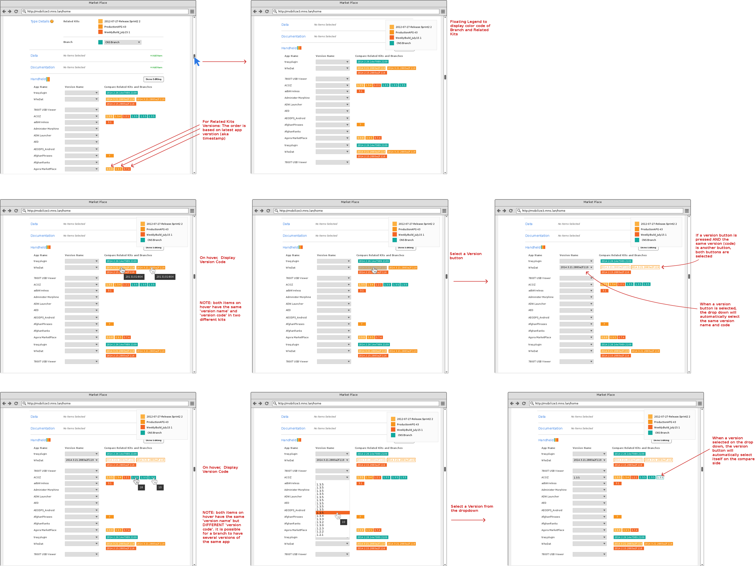
Mockups and Iteration For the next two years, I worked on TA Marketplace to redesign every page of the app store. I started off with the highest traffic user experience flows all the way to the admin, analytics and settings pages. I continued to use Balsamiq as my primary design tool, but I often imported screenshots and images to create high fidelity look mockups. For every flow, I presented anywhere from 3 to 10 versions in total after iterations to figure out the best design to develop with the project stakeholders: including in house developers and managers, our partner company Eucleo, TransApps program managers, and end users.
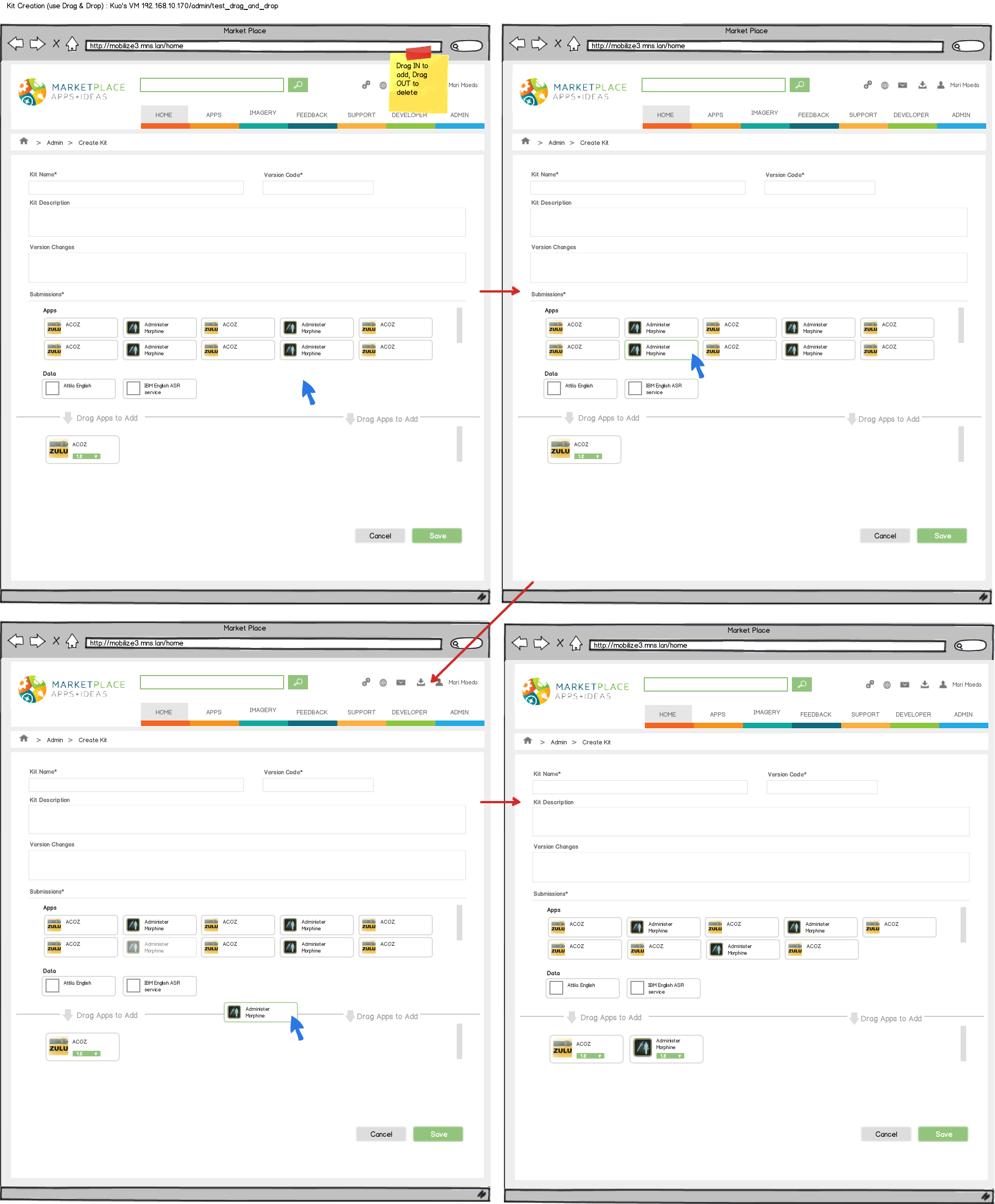
Interactive version of Creating a Kit using Drag and Drop
Simplified iteration similar to legacy form but improved
Refining Design, Test and Ship As a small company and being the only designer, I often collaborated directly with my managers and developers in the design process and helped ship out pages and new features. I became very comfortable using the inspect browser tools and would often develop the UI of an HTML page with stubbed data as a substitute for prototyping from mockups. When the HTML prototype is tested and approved, it was merged and passed on directly to a backend developer or senior front-end developer to build on top of. As the UX developer, I expedited the development and shipping process.

Updated mobile mockups to new design guidelines from UI facelift
CHALLENGES + SOLUTIONS
One Person Design Team As the only designer in the company I was in charge of driving the design vision and practices for our products at Metronome. It was difficult to sketch out as many solutions as possible when hitting a design wall or even knowing for sure if the design decisions I was making were absolutely right. I didn’t have a design manager to guide me, and I had to be self motivated and fail a lot to learn and ensure we were heading in the right direction.
Encourage Design Thinking and UX Practices Although I did not have a design team, I still had a development team. I regularly held design review meetings to teach and encourage design thinking among the developers. I could not always be available to answer every little design concern. To solve this I was very transparent about my design process and how I made decisions based on the guidelines and user goals. This encouraged developers to do the same and improve their own design skills to be confident enough to contribute to design feedback.

Mockups of Developer Dashboard
DISCOVERIES
Different UI for User Types TA Marketplace had multiple user login types including end users, developers, and administrators. However, the landing page and login into the software was the same exact UI for every user. When I did thorough competitive research, I found out that each user type had a completely different websites and UI that the was tailored to the user’s goals of using the site. The end user’s site was optimal to browsing and downloading apps, the developer’s site was centered around uploading apps and updating their pages, and the admin site was mostly analytics and data driven to monitor and manage the marketplace. Although it wasn’t the best practice, because of project restrictions I had to get creative to improve the single UI of the marketplace across all users.

Different user type login screens and home screens
LESSONS LEARNED
Finding Personal Design Successes As my first design job, I learned to be proud of the small wins and successes when a feature is approved to be shipped. Even if my ideas were not always chosen, I used them to educate and expose new ideas in a conservative space. By broadening the project team’s mindset I was always moving the product toward to improvement. I learned when to set my ego aside and how to work as part of a team for the better of the product and health of a project as a whole.
Link to Project Wiki: TransApps Wiki Page
Link Gizmodo Article: Inside the Military's Secretive Smartphone Program